
design research + user interface
era.
Overview
Client
era.
Objective
Harness the principles of the UN sustainability goals to develop a user-friendly app that empowers individuals and communities to make more energy-efficient choices. By creating an engaging interface, we strive to inspire a collective effort towards a more sustainable and environmentally conscious future.
Roles
Design Research + Graphic Designer
Programs
Illustrator & Photoshop
The Process
Mission Statement
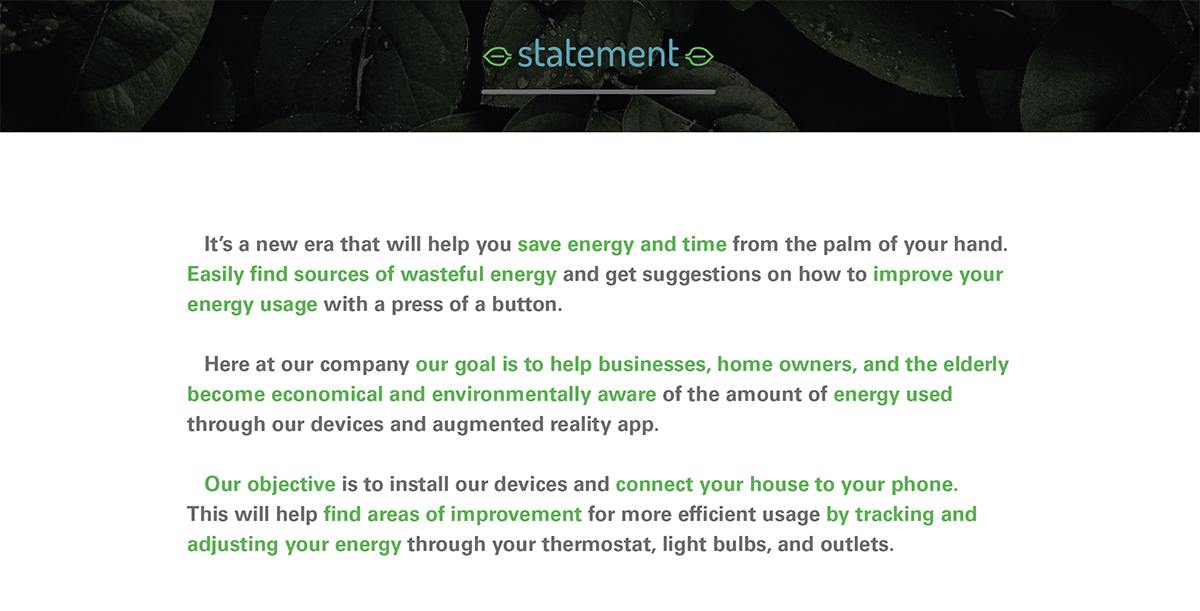
I started by helping era build their mission statement to help their communities become economical and environmentally aware through energy usage.
UN Sustainability Goal
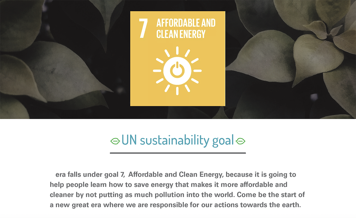
They were inspired through the UN Sustainability Goal.
The Research
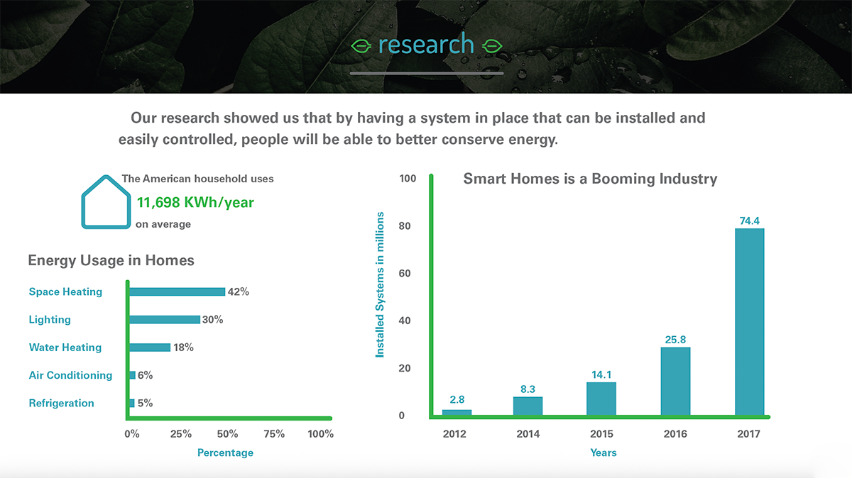
After researching more into the energy usage of homes, it was discovered that if given access people are able to conserve what they are using.
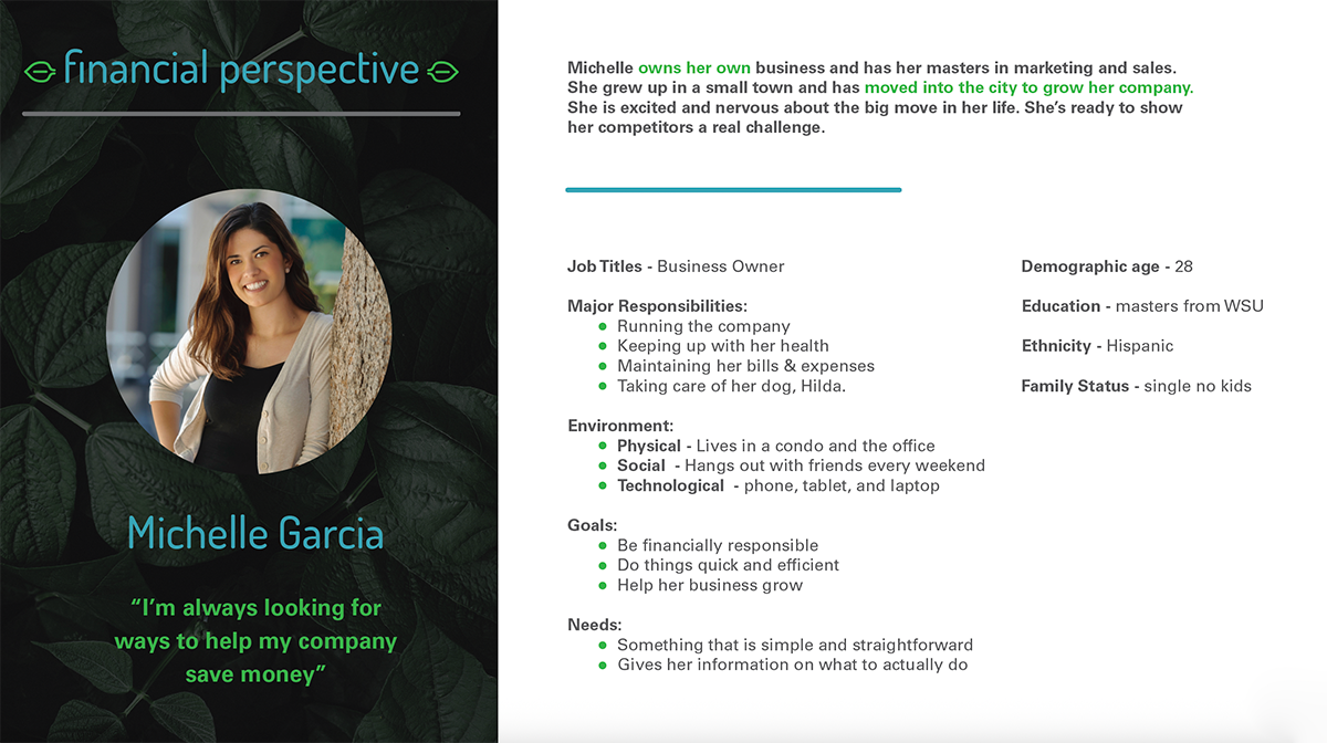
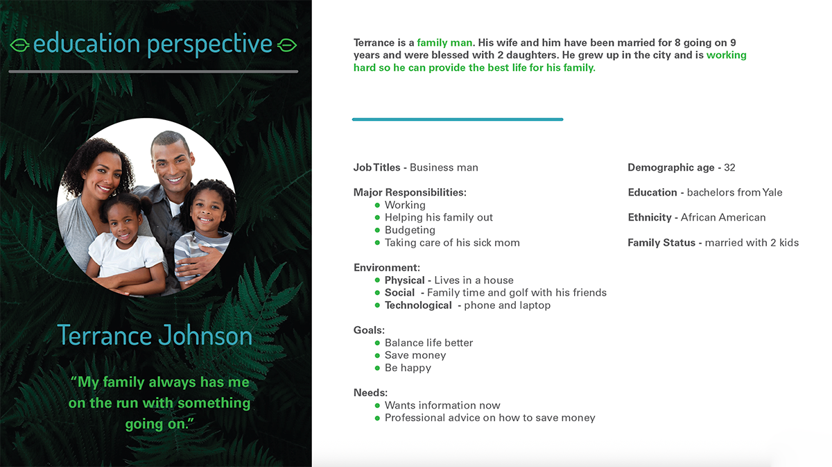
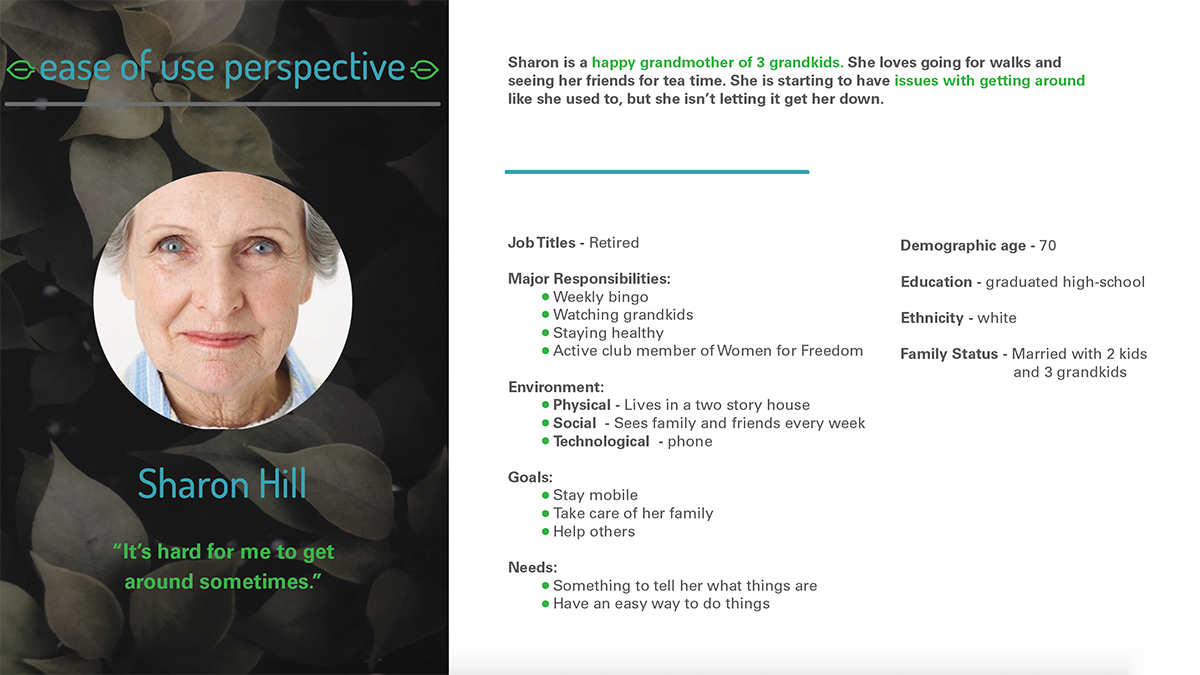
The Three Personas for era.
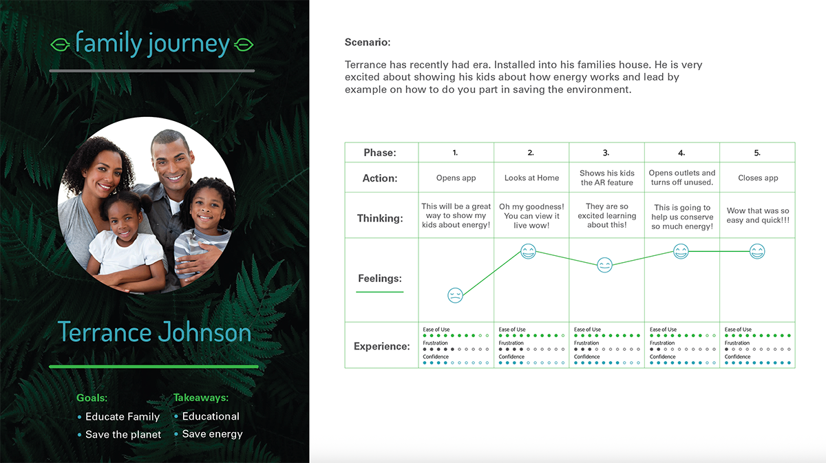
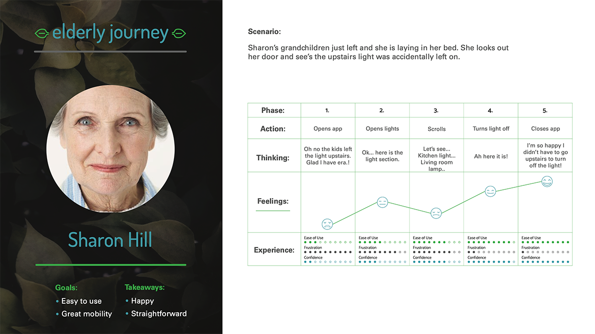
Research was conducted into creating the personals of the three areas of potential clients. These perspectives are financial, education, and ease-of-use.
The User Experience Journeys
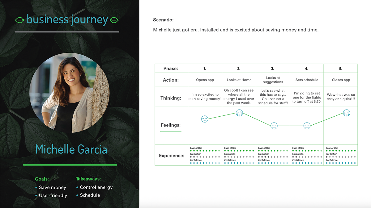
Every individual’s experience is different. A user experience was created for each of the perspectives.
The Process
Inspiration
After consulting with our client, we created some inspiration about what they are after and made a mood board.

Rough Drafts
Starting out we had several iterations of black & white logos. We met with our client to review and improve upon the aspects they liked of each.


Finalizing The Color
After our client narrowed down the desired logo we moved into color theory and met with them to finalize their logo.

The Final Logo
After weeks of collaborating, we unveiled the final logo to Jack Ruby’s Barbecue Company. They loved the bold colors and how it spoke to their brand.

Product Packaging
Building on the excitement of our collaboration, we dove into the design of a captivating label that would not only highlight the rich flavors of Jack Ruby’s barbecue sauce but also embody the spirit of their brand. We focused on creating a design that would stand out on the shelves, ensuring that every detail resonated with their loyal customers. Through a blend of vibrant colors and eye-catching typography, we crafted a label that tells a story—one of tradition, passion, and the love of great barbecue. Seeing our client’s vision come to life in this new format was incredibly rewarding, reinforcing our commitment to delivering exceptional branding solutions that drive success.


Project Summary
Outcome
The transformation of Jack Ruby’s Barbecue Company has been nothing short of extraordinary, fueled by the vibrant logo and captivating product label we crafted together. This new visual identity not only captures the essence of their delicious barbecue but also resonates deeply with customers, creating an unforgettable brand experience. The bold colors and unique design elements have helped elevate their market presence, leading to increased recognition and sales. Watching Jack Ruby’s thrive as they embrace their renewed identity is a testament to the power of thoughtful branding, and we are proud to have played a role in their flavorful journey.
Acknowledgments
This logo and product packaging was created in collaboration with RobinTek, where Sara Anne interned at.
